DriveWell Go Redesign
Design System
Timeline
September 2023 - Present
Team
2 designers, 6 engineers
Role
Design systems, research
Example of a page from the design system for the redesign project.
Overview
In September 2023, I was tasked with creating a design system for the redesign of our flagship app, DriveWell Go. Initially, the team included two designers, two engineers, and one product manager, but has since expanded to include four additional engineers.
The approach we take in building this app and design system will establish the standard for future product development at CMT. The design system leverages best practices, including design tokens, accessibility, and responsive behaviors, to ensure excellence in design.
Snapshot of the first component library in Sketch at CMT.
Background
The existing component library for DriveWell Go is exclusively used by designers and was originally created by me in 2021. At the time, my understanding of design systems was limited, so I approached it with what knowledge I had.
Today, my grasp of design systems has grown significantly, and I recognize their potential and impact. When the chance to develop a design system for the app’s redesign project arose, I was eager to apply my skills and deepen my expertise through hands-on experience.
Execution
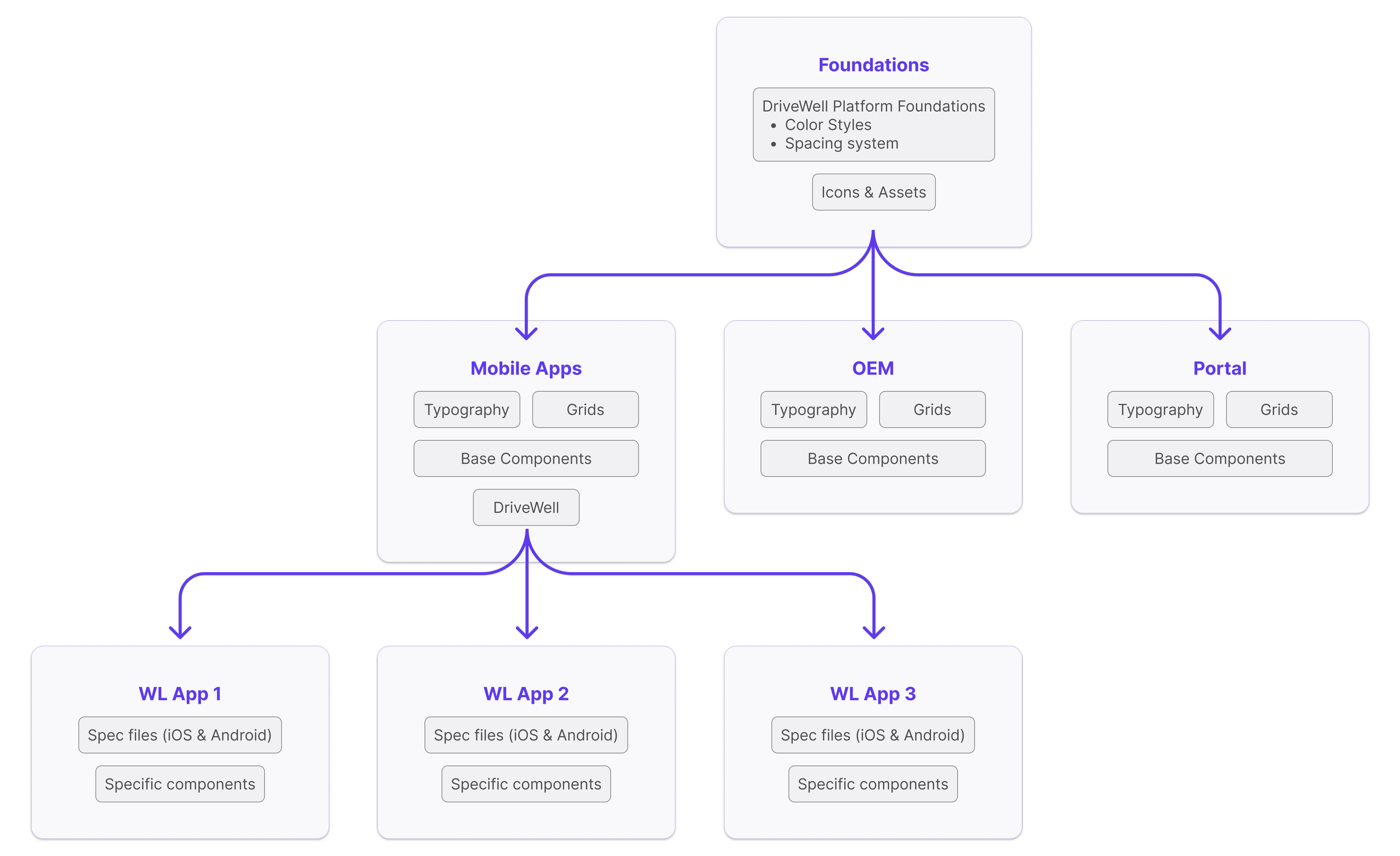
File structure that the new design system will aim to support
When I first approached this design system project, I focused on creating a thoughtful file structure. I asked myself, “How can I design this system to be scalable across other CMT products?”
My immediate goal was to streamline the white label process, creating a system that supports our flagship mobile app and the 30+ white-labeled apps derived from it.
My solution involved establishing a Global Library that includes colors, icons, and a spacing system, where our tokens would be stored. This Global Library would feed into smaller product-specific libraries, each containing base components, typography, and grid systems tailored for web, mobile, and OEM products.
The primitives color palette and iOS type styles.
Once the file structure was established, I started researching the setup of a tokenized system (refer to the Tokenization project for more details). Collaborating with the other designer on the project, we developed an inclusive color palette that met contrast accessibility standards. We also established typography styles and an iconography set, all tailored to the screen designs in progress.
Showing the size responsiveness of components and screens.
Now it was time to begin creating the components. There were a few key considerations to keep in mind during this process:
Ensure touch targets meet platform standards: minimum size for iOS is 44x44 and for Android is 48x48
Adhere to WCAG color contrast guidelines for accessibility
Design all components to be responsive across different device sizes
Use clear and consistent naming conventions that are easy for both engineers and designers to understand
By adhering to these principles, the components can adapt to various use cases and remain flexible to accommodate future changes.
Exploring use of the EightShapes Specs plugin vs annotations in Dev mode.
Once the components and screens were completed, I shifted my focus to documentation. I am currently experimenting with different approaches to create documentation that is most helpful for the engineers working on the redesign project.
I am also considering how other designers will engage with the design system in the future. To optimize its usability, I plan to conduct interviews and usability tests with designers to identify the essential information they need to work effectively with the system.
Adoption
A key challenge has been driving design system adoption among engineers, as this is the first time our company has implemented a design system. This has been a learning curve for everyone involved.
Navigating this ongoing learning process, I continuously explore new strategies to promote adoption. Currently, since the system supports only one product, I am focused on helping a small core team of engineers utilize it effectively.
I have conducted one-on-one meetings with engineers to understand their workflow when building the app and how they use Figma in the process. During these meetings, I introduce them to Figma features that can improve their workflow and increase consistency between Figma mockups and the beta app.
These one-on-one sessions have evolved into weekly group meetings where we collaborate to optimize our teamwork and manage the handoff of design system components. This approach allows me to tailor the design system to the engineers' needs, thereby encouraging their adoption of the system.
Personal Impact
This project has been a significant learning experience, allowing me to apply my design systems knowledge in a real-world context. It's been both rewarding and challenging, enabling close collaboration with engineers and a deeper understanding of coding and app development.
Additionally, I have had the opportunity to mentor and collaborate with other designers on building components, helping them enhance their knowledge of properties, auto-layout, and constraints.
I continually research design system best practices to provide better support to the team. To expand my understanding of the relationship between design and code, I am currently taking Dan Mall’s Design Systems 101 course. Below are other design system-related courses I have previously completed:
Design System University, How to Use a Design System in Figma
Design System University, How to Use a Design System in Code
Molly Hellmuth’s, Design System Bootcamp
Nielsen Norman Group, Design Systems and Pattern Libraries


